Case study · Paigam · paigam.co.in
What the PDF lost
An Indian wedding invitation is a status object before it is an information document. Digitising it kept the information and threw away everything else.
- Role
- Solo: research, design, build, copy, pricing
- Status
- Live, small and honest about it
- Year
- 2025–2026
- Constraint
- Must survive a WhatsApp group
The problem
Two failures, and only one of them is logistical
The obvious problem is delivery. A printed Indian wedding card is either hand delivered or posted, and post runs twenty to thirty days. Invitations sometimes arrive after the wedding they were inviting you to.
Printed cards also cannot absorb a change. Once a venue or a start time is on paper it is fixed, and any correction has to travel separately by phone. They cannot link to a map either, so guests navigate by venue name, and venue names in Indian cities repeat constantly.
That part is easy to see, and it is the part everyone has already solved by sending a JPEG instead. The second failure is the one that made this worth building.
What the card was actually doing
A physical invitation carried signal. Who delivered it, and whether they came in person. How it felt in the hand. Whether it was handmade or run off a press. Guests read effort and status off the object itself, and different cards said different things about the family sending them.
A forwarded image carries none of that. Every guest receives the identical file, nobody delivered it, and there is nothing to open. The information survived the move to digital. The occasion did not.
Everyone had solved sending the invitation. Nobody had solved sending the invitation to you.
The decision
Twelve traditions, not one theme with a colour picker
The obvious build is one well-made template with a palette selector, and it is the wrong one. Recolouring a single design produces exactly what already exists: another image-style template card, distinguishable from the next couple’s only by hue.
India does not work that way. Communities differ in ritual, in ornament and in what a wedding is supposed to look like. So each template is a separate visual world rather than a reskin.
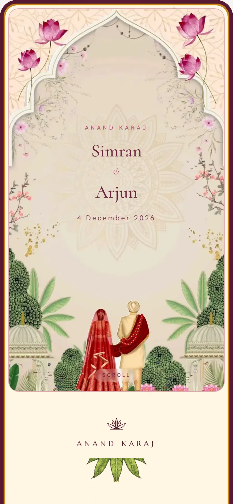
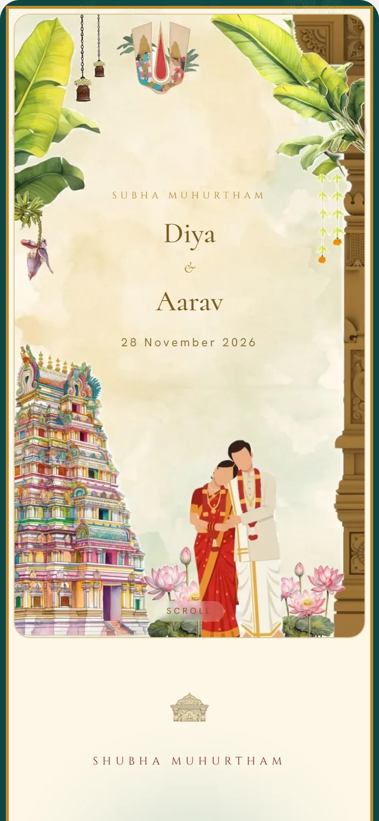
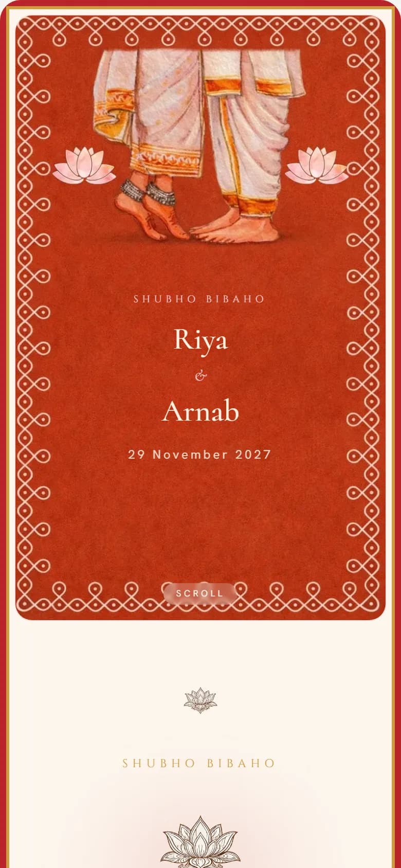
Same moment in the invitation, three templates. The argument is that these are different worlds rather than palette swaps.
How the traditions were drawn
From reference images and my own eye. Not from community consultation, and that is worth saying plainly rather than implying otherwise: nobody from these traditions has formally reviewed the work. It is the obvious next step, and the first thing I would want before the collection grows much further.
What kept it from becoming costume was a rule rather than a process. A template earns its place by being rooted in a tradition someone would recognise on sight, and several got killed for being a colour idea wearing a tradition’s name.
The clearest expression of that rule is a single field in the editor. Every template ships carrying its own traditional wording, and the override field reads “Leave blank to keep your template’s traditional wording.” A Gujarati family does not have to know what a Toran invitation is supposed to say. The template already knows, and the field exists only if they want their own words instead. Cultural knowledge as a default rather than as homework.
What I turned down
Three things I decided not to build
Rejected
Collecting shagun on the invitation
Adding a UPI handle to the card is the obvious monetisation, and every guest already has UPI. I left it out. An invitation with a payment field attached stops reading as an invitation and starts reading as a payment request, and the entire product exists to make the thing feel warm. Money is not the failure mode I was fixing.
Rejected
Templates built from a new colour idea
I started several and killed them. A template earns its place by being rooted in a tradition someone recognises. Adding one because I liked a palette dilutes the ones that mean something, and turns the collection back into a swatch library.
Revised, not deleted
Designs that read as letters
Some early templates came out closer to correspondence than to celebration: too textual, too quiet, no sense of occasion. Rather than cut them I rebuilt them, which was the right call, because the fault was in the treatment rather than in the idea.
The moment that matters
The product is the link preview, not the invitation
A wedding link does not get discovered. It gets pasted into a family WhatsApp group alongside forty other messages, and it has about one second to explain itself before it is scrolled past. If it arrives as a bare URL, it reads as spam.
- The URL carries the couple's names, so the link is legible before it is tapped.
- The preview image renders both names, the date, and the artwork of the template they chose.
- Which means the preview alone does the job a physical card did on arrival: it announces whose wedding this is, and it looks like something.
- Tapping it opens the part a card could never do.
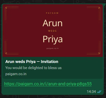
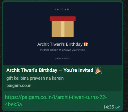
Built mobile first, deliberately. Reviewing the existing digital invitation products, most were laid out for wide desktop screens. Nobody receives a wedding invitation from a friend and then opens a laptop. They tap it where it arrived, inside WhatsApp’s in-app browser, usually on a mid-range Android phone.
The second collection
Birthdays, where the interaction is the design
The wedding templates differ by tradition. The birthday templates differ by mechanic, and that turned out to be the more interesting problem.
A wedding invitation has a fixed job: announce, inform, direct to a venue. A birthday message has no such contract, which frees the whole thing to be an experience rather than a document. So each design starts from a verb rather than a look.
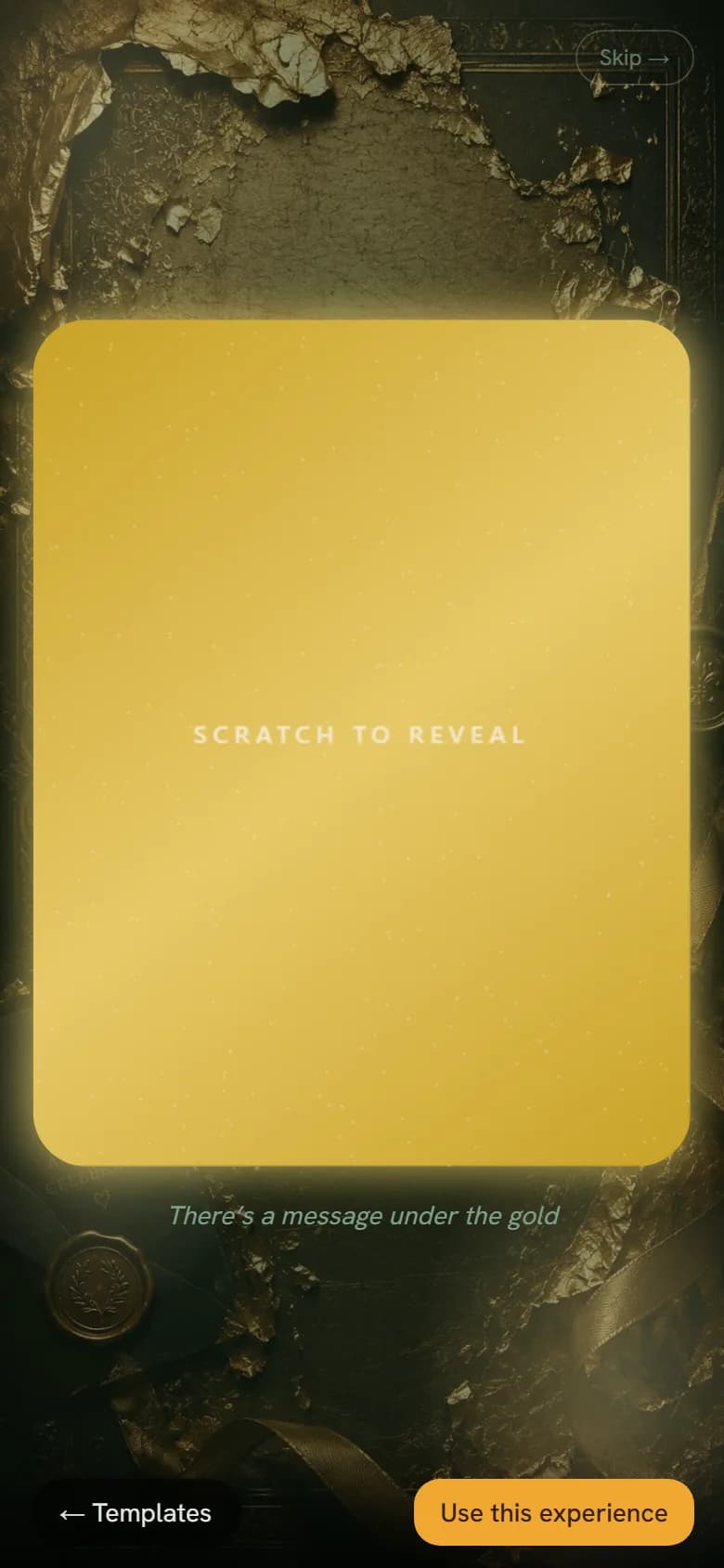
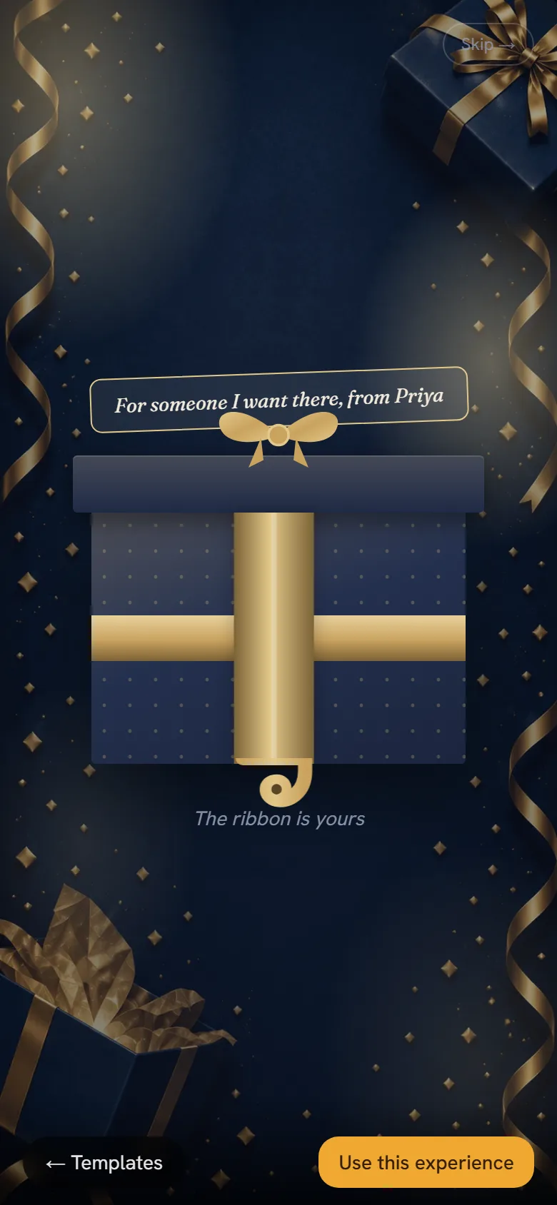
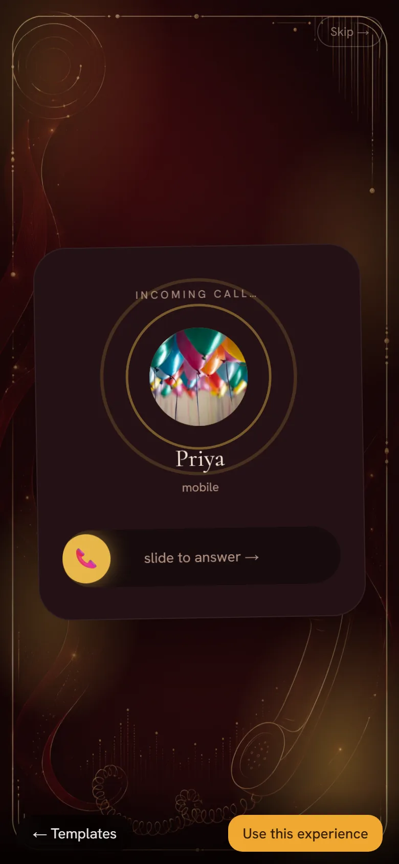
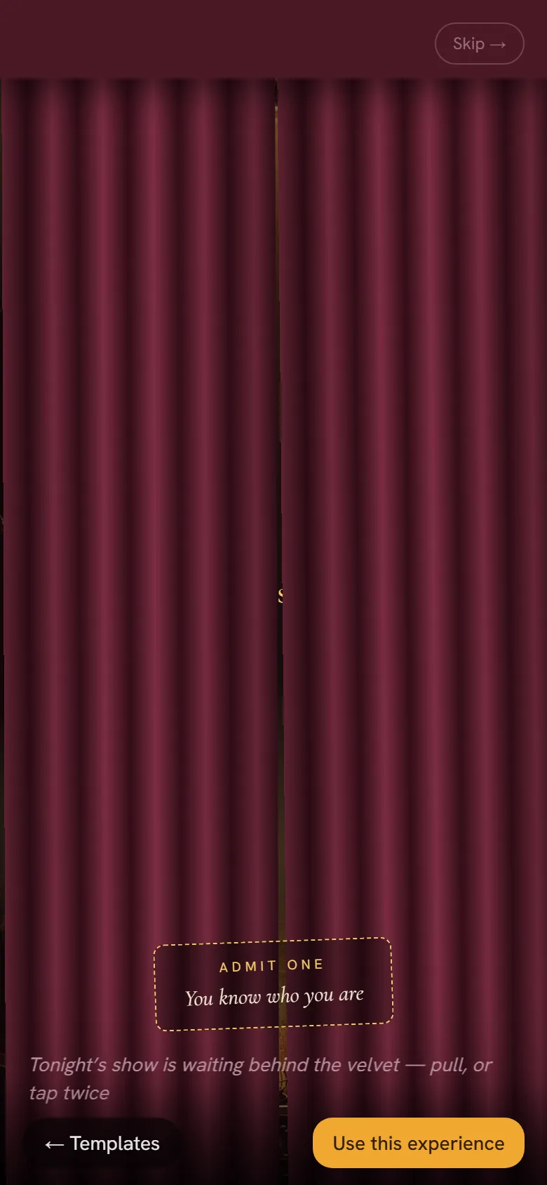
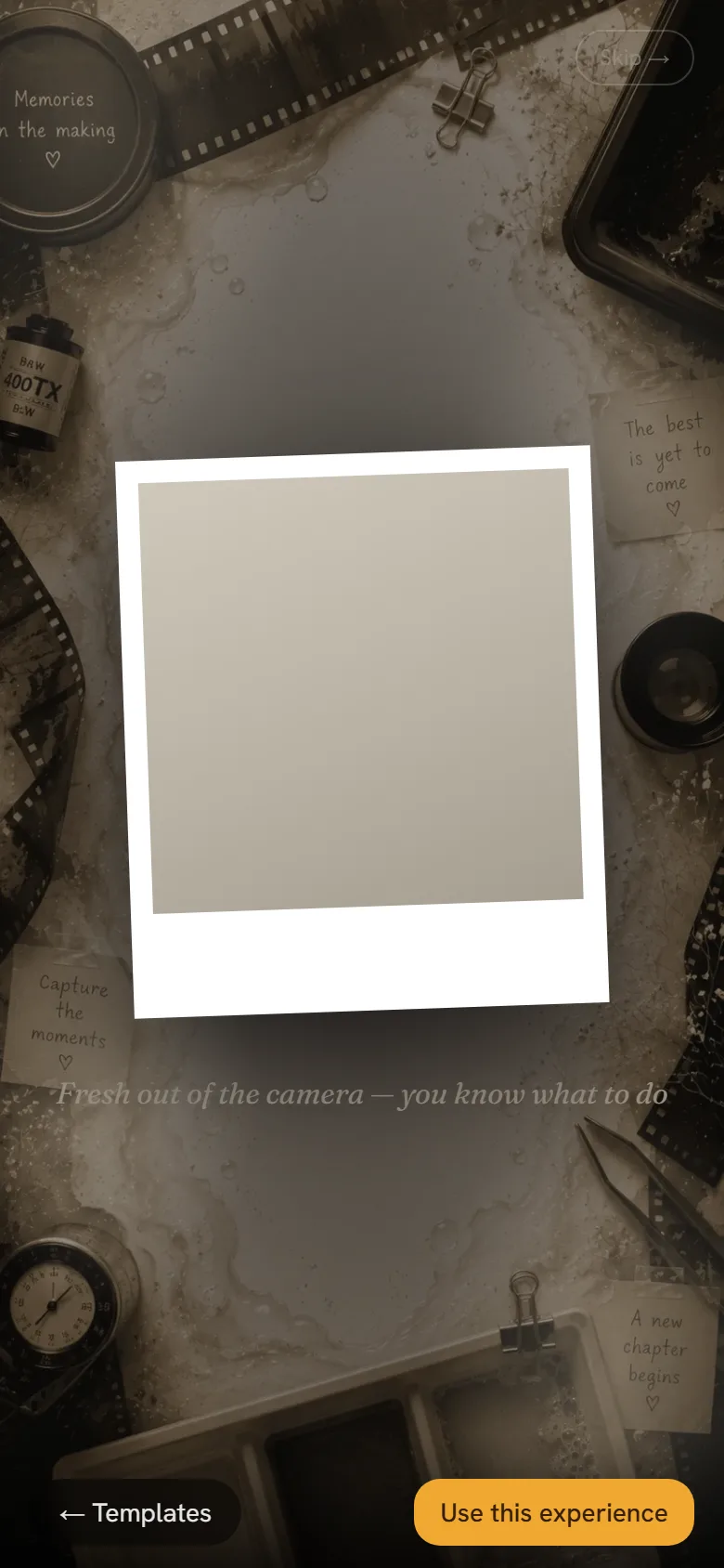
The constraint that shapes all of them is the same one from the wedding set: this opens inside WhatsApp’s in-app browser, on a phone, one-handed, possibly on bad data. So every mechanic has to work with a thumb, resolve in seconds, and degrade to something readable if it does not run at all.
The one worth arguing about
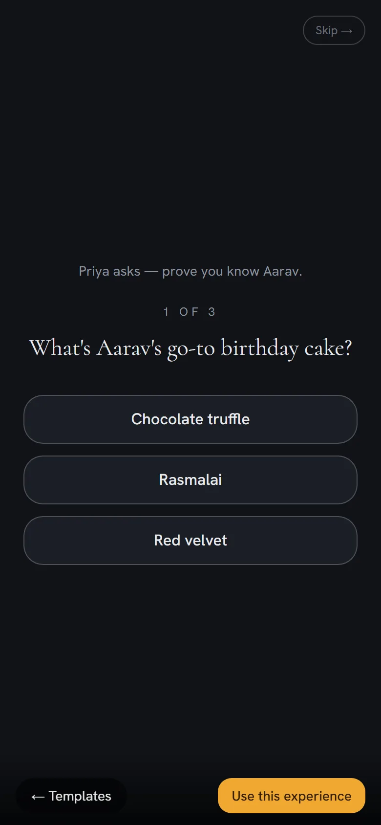
Vault does not open. It asks. Before the message appears, the recipient answers three questions only someone who actually knows the birthday person could answer, and only then does it unlock.
That inverts what an invitation is for. Every other design in the set works harder to be opened; this one deliberately makes opening harder, and it is better for it. A message that made you prove you knew someone is worth more than one that opened on arrival, because the effort is the affection. It is the same argument as the whole product, pushed to its edge: the value was never the information.
Building one
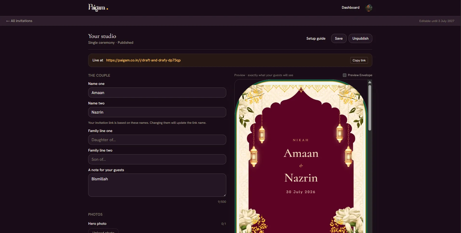
Preview first, pay second
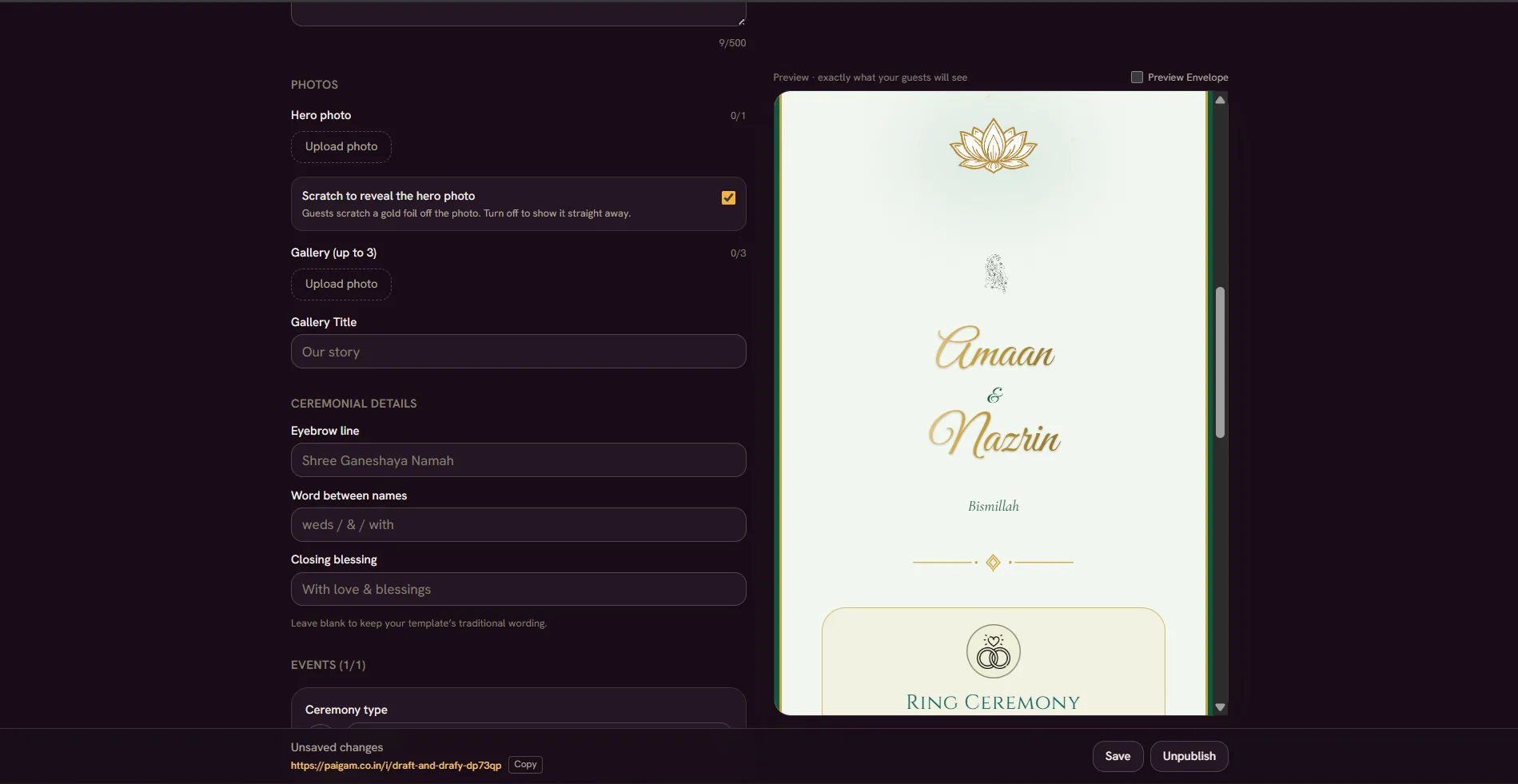
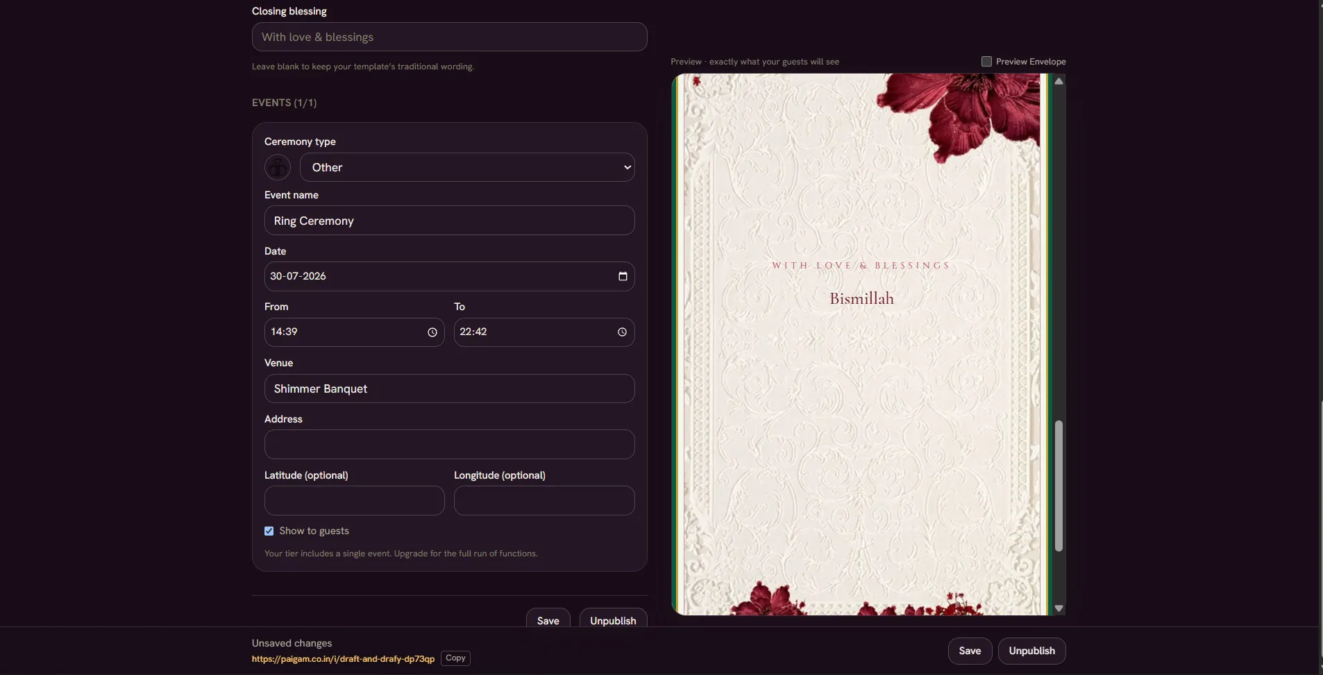
The order is deliberate. A couple browses templates and can see the full experience before spending anything, so the paywall sits after the value is visible rather than in front of it. After payment they land on their own card and fill a plain form with the invitation rebuilding live beside it.
Live preview was there from the first version. For a product whose entire pitch is how the thing feels, describing the result in a form field instead of showing it would have been indefensible.
What I learned from use
Minimalism reads as absence
A word on scale before the finding, because it changes how much it is worth. The user base is small, and small in a particular way: I can account for how nearly everyone arrived, because they came through somebody who already knew me. Nothing below is a statistic. It is a direction, and it is written that way deliberately.
Finding
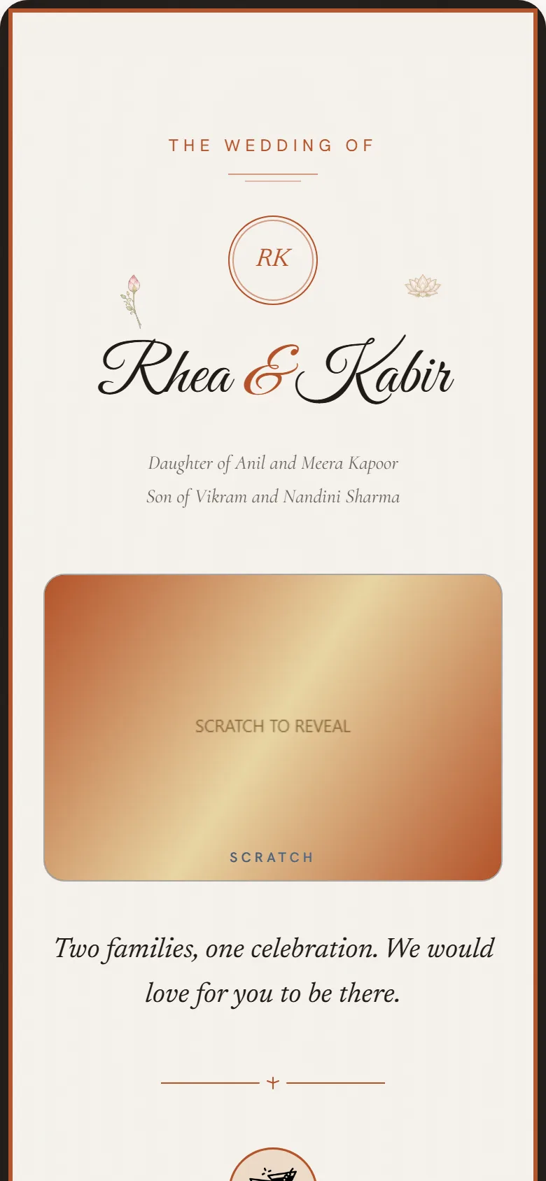
The most maximalist template wins, and the quietest one is never chosen
I had assumed restraint would read as premium. It does not, for this occasion. Indian wedding visual language is saturated and abundant, and a spare card does not read as tasteful against that backdrop. It reads as though nobody made an effort, which is precisely the signal the physical card existed to send.
Directional, not statistical. See the note on scale above.
What I did about it
Six of the wedding designs are now Phulkari variants: Ghungat, Chann, Gulaab, Sanjh, Nilak and Vari. Rather than spread effort evenly across traditions, I went deeper into the one people actually chose, and built a family inside it instead of another unrelated theme nobody had asked for.
What the feedback was actually about
The early users were reachable enough that I saw several of these invitations in use in person. Almost none of what came back was about structure. It was about type and styling, and about experiences people wanted added.
That second category matters more than it sounds, because it is where the birthday collection came from. People did not ask for a better card. They asked for more things the card could do, and the mechanics above are the answer to that. The collection grew in the direction people pulled it, rather than the direction I had planned.
Pricing as distribution
Priced so an aunt can buy it
The first pricing model was considerably higher: ₹799 for a single ceremony and ₹1,499 for the full celebration. Both originals still sit struck through on the page. I brought them down to ₹99 and ₹499, roughly a third of what one person spends on an average meal.
The reasoning is not really about affordability. The couple is often not the person who finds the product. A cousin, a sibling or an aunt comes across it and passes it on, and at a low enough price that person can simply buy it and hand it over rather than making a recommendation the couple then has to act on. The price is set to remove friction from the person doing the sharing, and to cover deployment.
₹99 was ₹799
Single ceremony
₹499 was ₹1,499
Up to eight events
32
Designs, two occasions
Solo
Research through payments
What I would redo
I solved the product and ignored the distribution
The pricing was designed so the invitation would spread through families, and then I never built anything to make that happen. A wedding invitation is seen by several hundred people by definition, every one of them a plausible future customer, and there is currently nothing on the invitation or after it that turns a guest into the next person who uses this.
That is the piece I would go back and design first. The product assumed reach it never engineered, which is also the honest explanation for the scale note above.